Manopart is the innovation and acceleration center of Part Rubber Industrial Group. This center has been established with the aim of providing a dynamic and innovative environment to meet the needs of the automotive, polymer and renewable energy ecosystem.
Ideation is one of the most important values in Manopart. They nourish the idea to reach the stage of implementation, and reaching the final stage is essential to them.
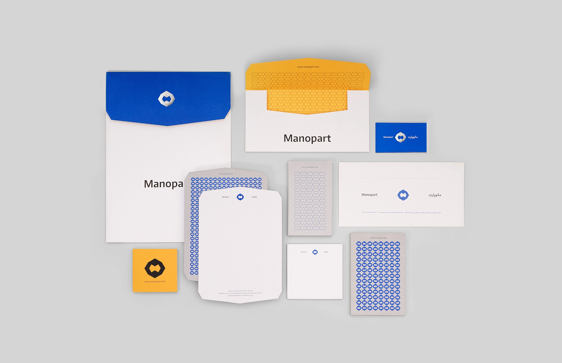
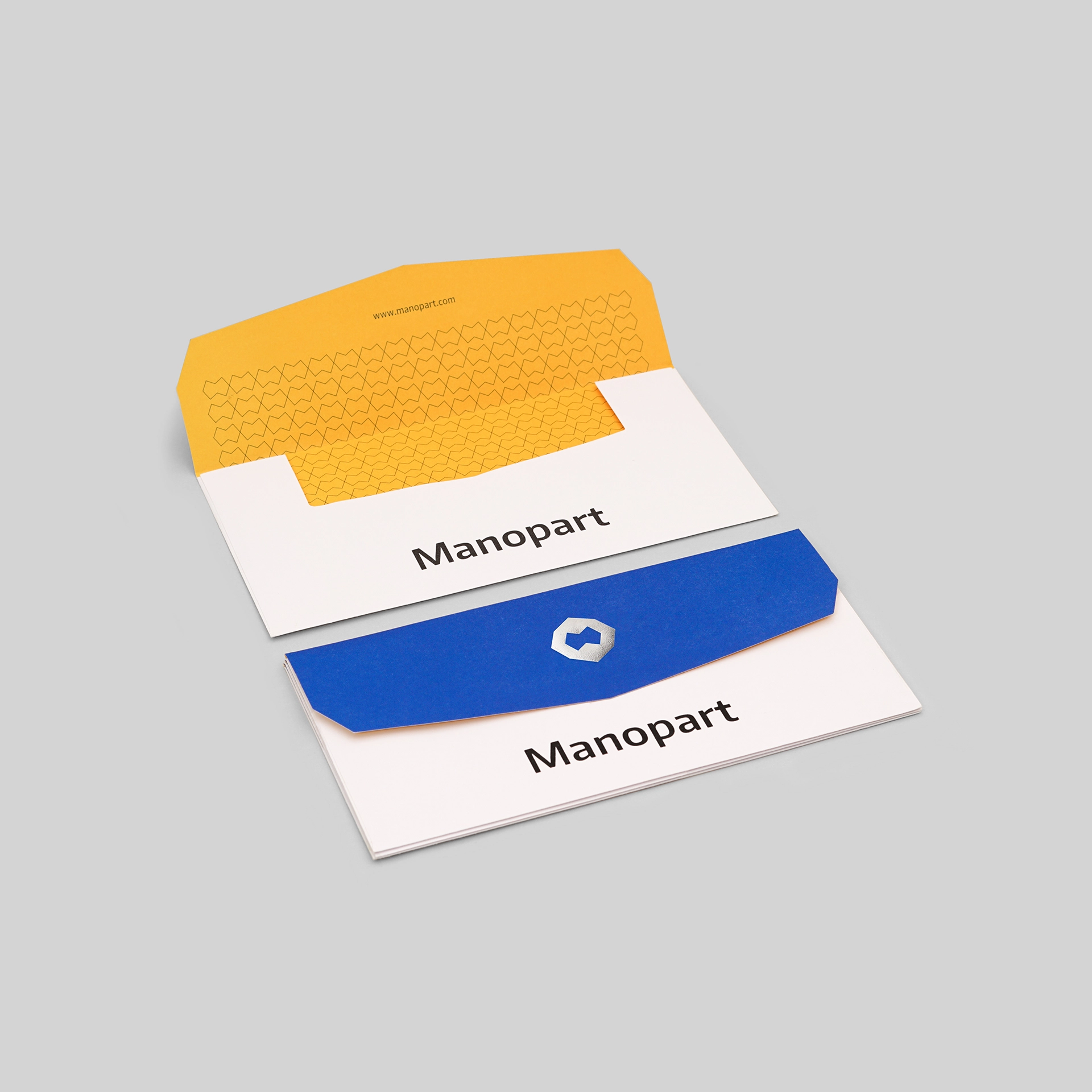
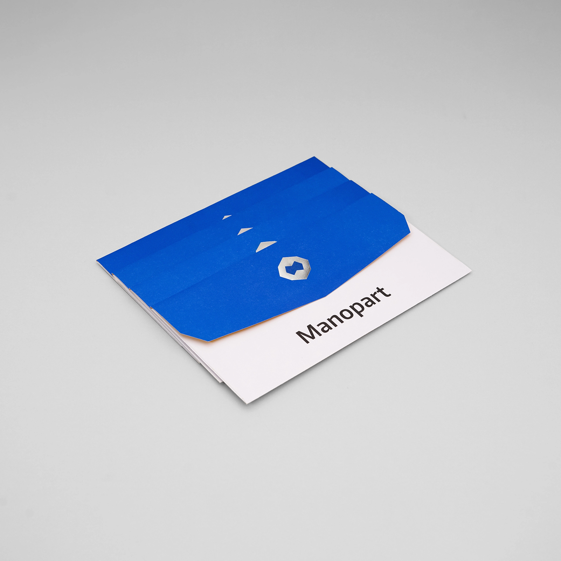
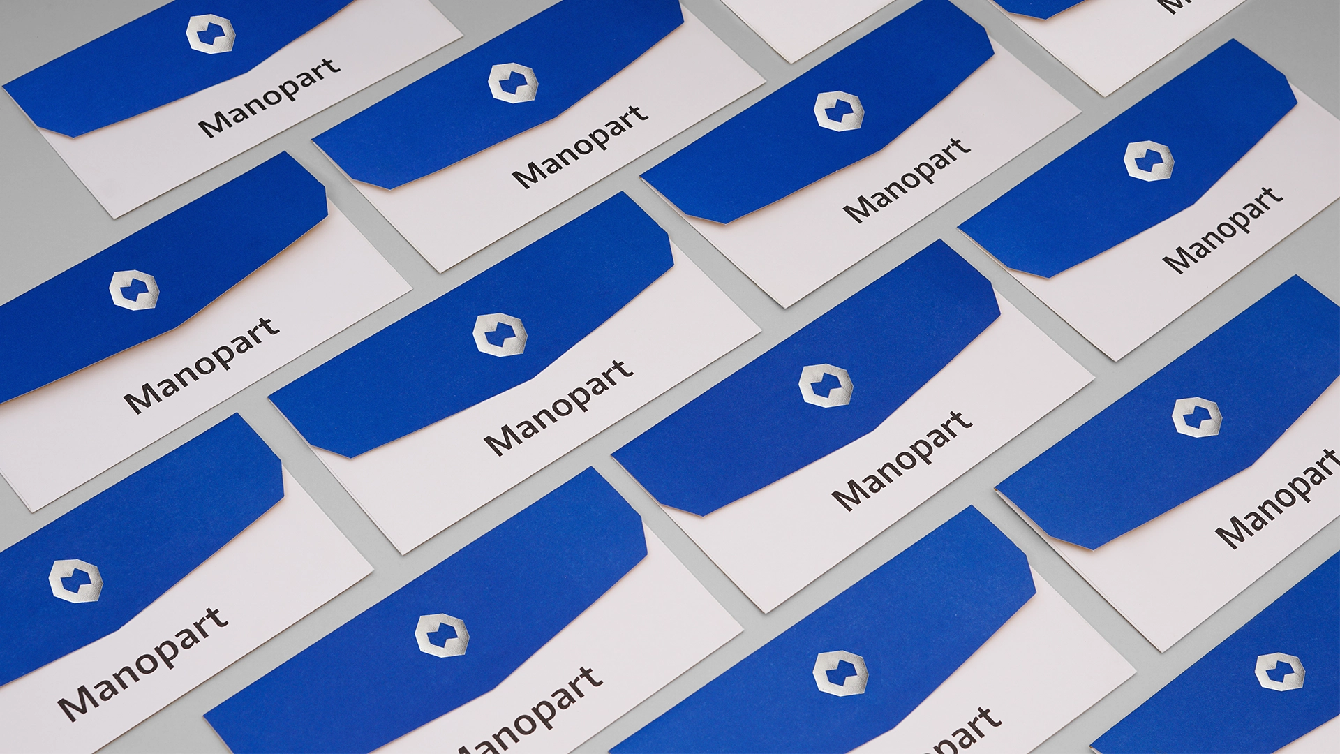
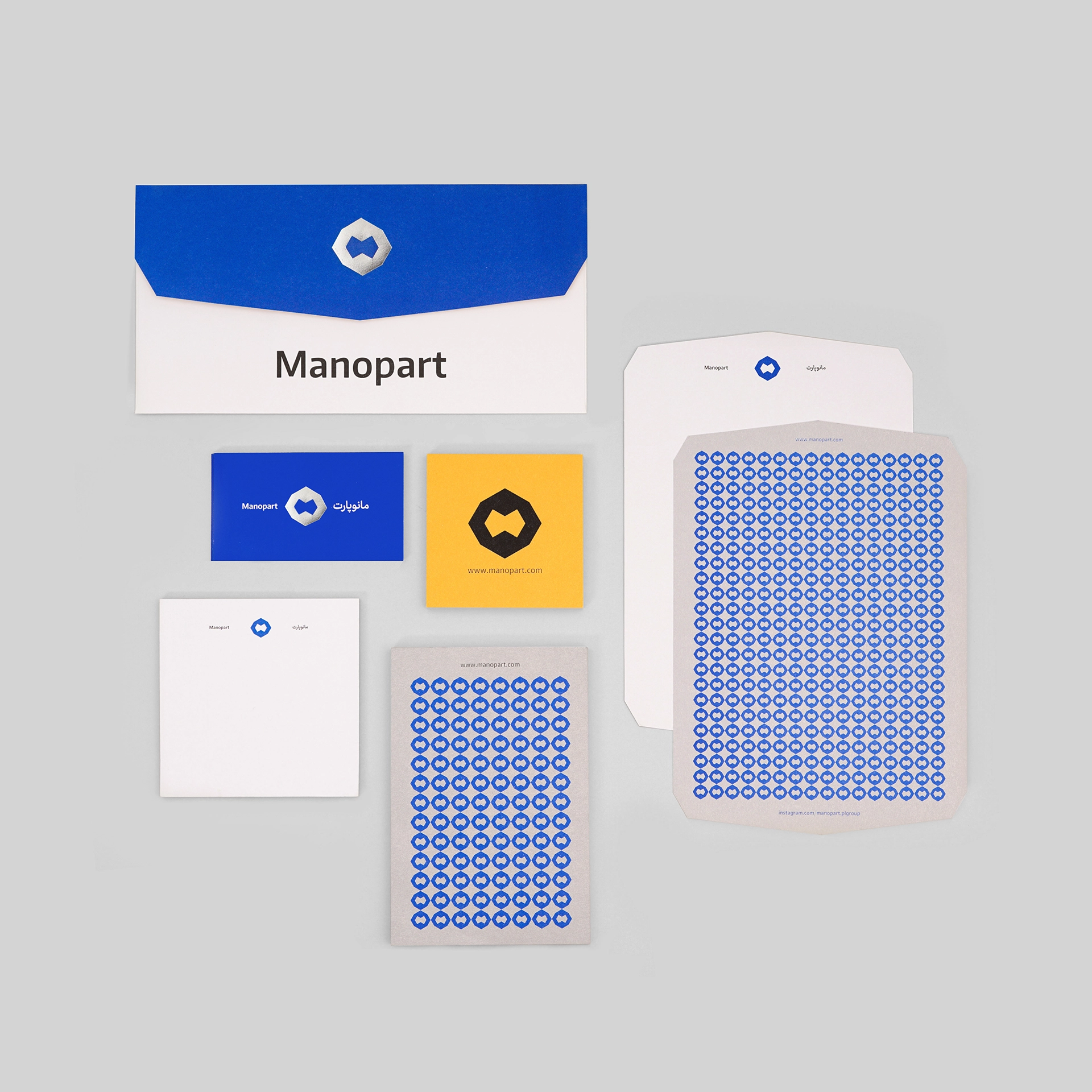
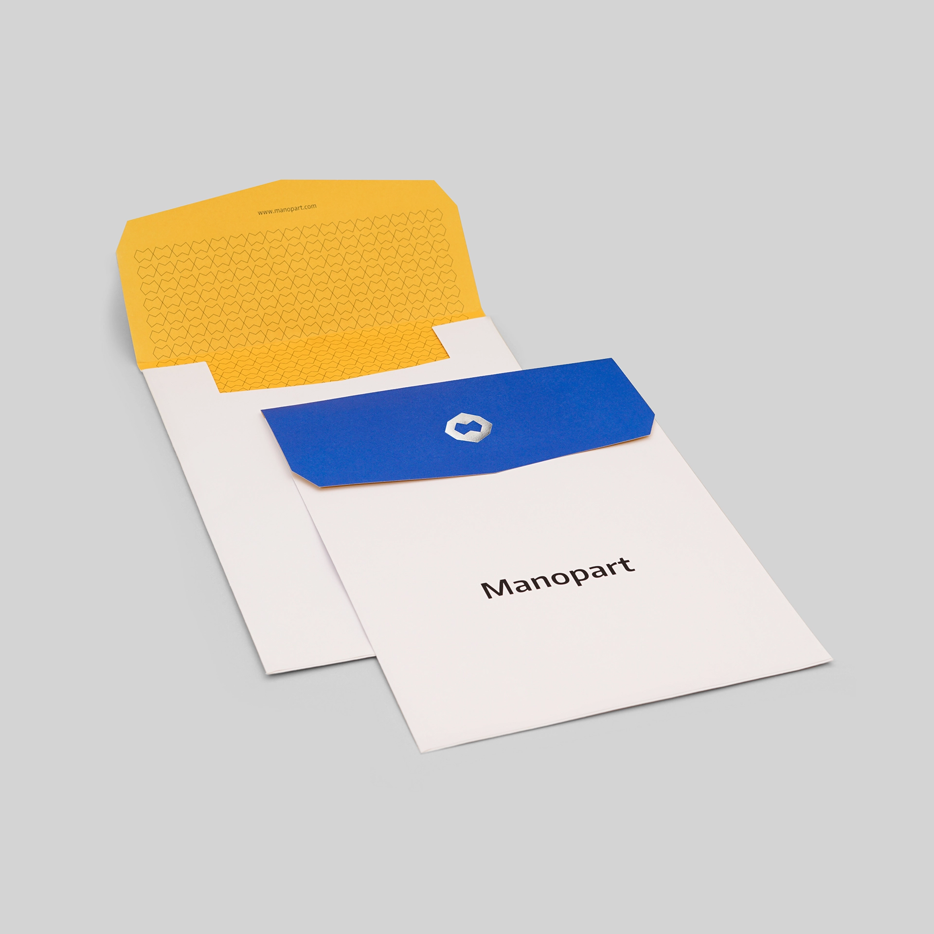
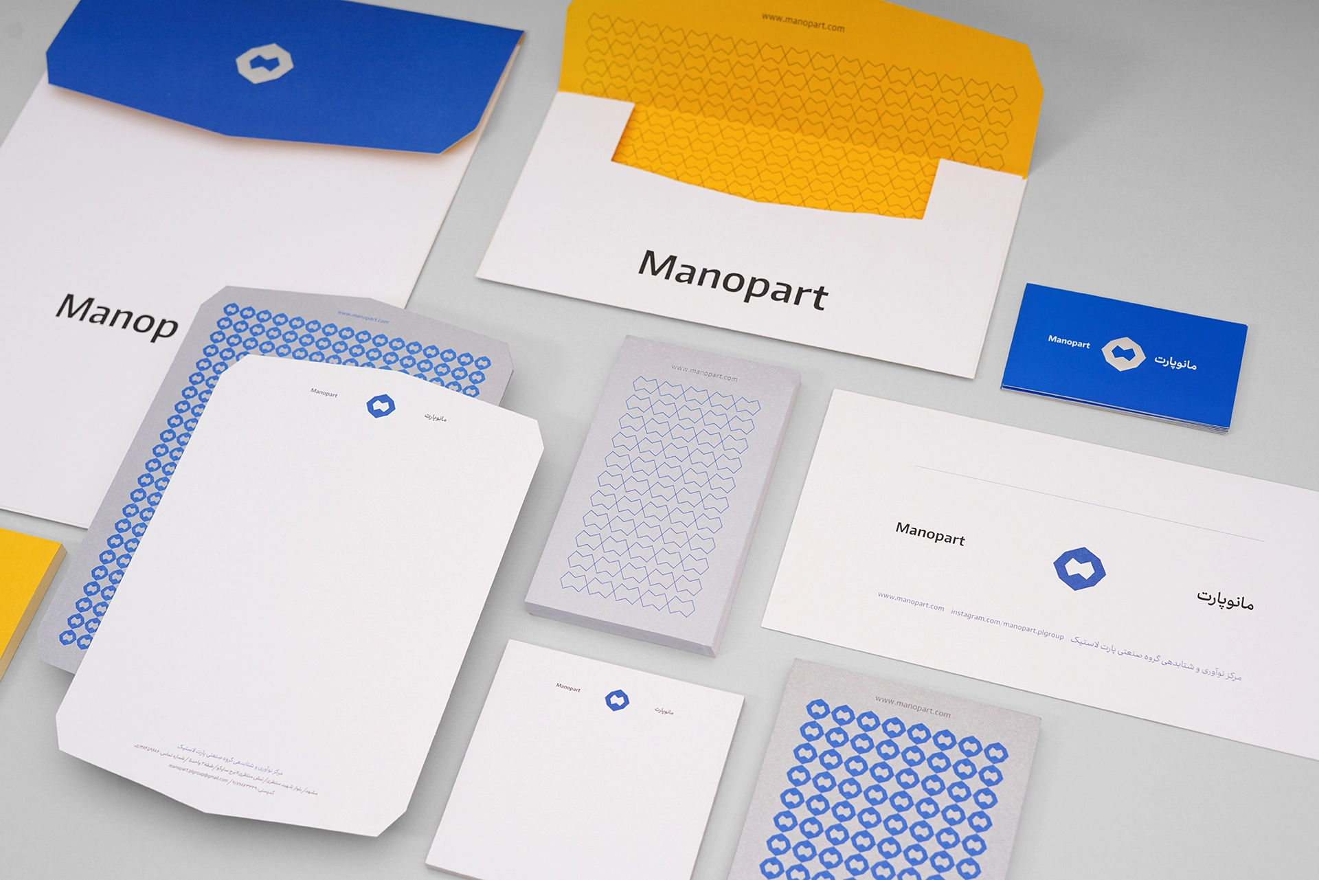
The image logo of the brand has geometrical similarity to a cut diamond, which is derived from the geometry of Iranian motifs to represent the origin of its activity and expose the concept of the value of ideation and creativity in the image of a valuable diamond. In the center of the logo, a form in the shape of the letter M is located, which is connected in a mirror manner. The letters of Manopart’s name in Farsi and English writing consist of 8 letters, which is also included in the design of the logo’s dimension.